B2B Quoter
Problem
A business unit had an established quoter designed for B2C consumers but lacked a solution tailored to the B2B market, which was now their top priority.
Goal
Design and deliver a B2B insurance quoter that meets the needs of brokers and agencies.
Team
1 UX Designer, 6 Developers, 1 Project Manager, 1 Product Owner
Tools
Figma, Miro, Pivotal Tracker, Rally
Timeline
11 months (2025)
Building a B2B Quoter
At the start of most projects in our lab, we dedicate two weeks to research. This upfront investment creates UX runway and helps mitigate risk early.
However, this project introduced an immediate challenge: the client explicitly restricted us from conducting any direct user research. While we advocated for the value of user engagement, the constraint remained. As a result, I had to identify alternative ways to gather insights and guide design decisions without direct user input.
Research
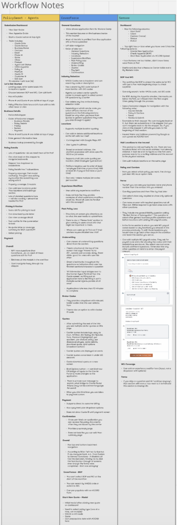
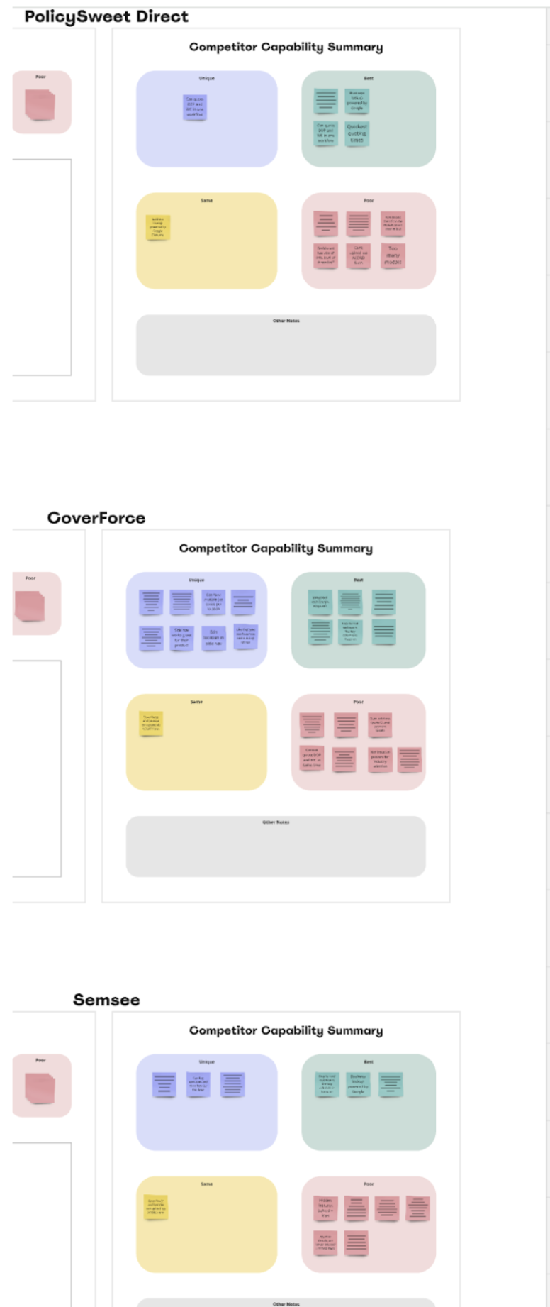
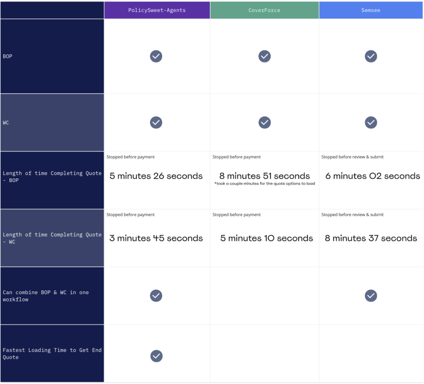
Fortunately, the client provided access to competitor products. I used this opportunity to conduct a two-week competitive analysis, focusing on industry standards, workflows, and feature sets.
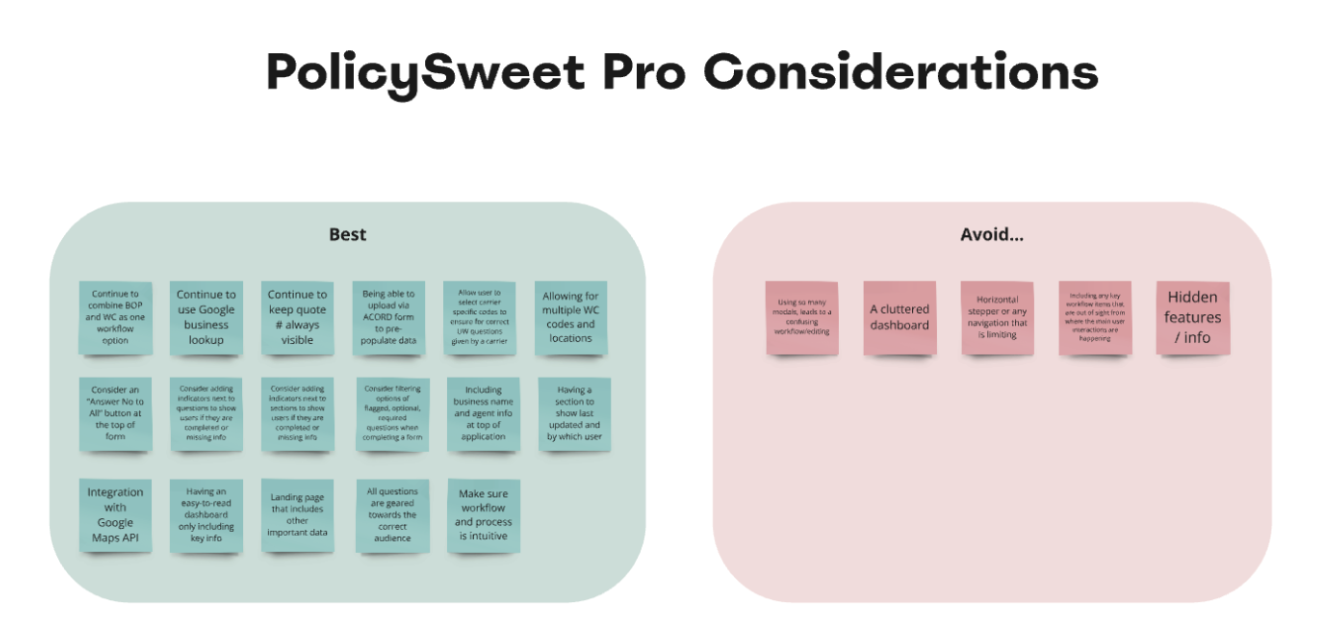
Through this research, combined with stakeholder discussions, I developed a clear understanding of how the business wanted to position their product:
Aligned with industry standards:
- Maintain familiar question structures
- Follow expected quoting workflows
Opportunities for differentiation:
- Enable combining multiple policy types within a single quote
- Provide faster visibility into referral or decline outcomes
Competitive Analysis Deliverables
Design Highlight: Navigation
Based upon my competitor research, it became clear that the existing horizontal stepper used in the existing B2C product would not scale for the new B2B tool. That pattern was optimized for guiding less experienced users step-by-step through a simplified process.
In contrast, B2B users, such as brokers and agents, are more experienced and require greater flexibility. Their workflows are often more complex and non-linear.
To address this, I designed a vertical stepper with expandable substeps. This approach allowed:
- More complex information architecture
- Clear visibility into progress
- The ability to navigate backward once steps were unlocked
This component was later incorporated into our design system for reuse across future products.
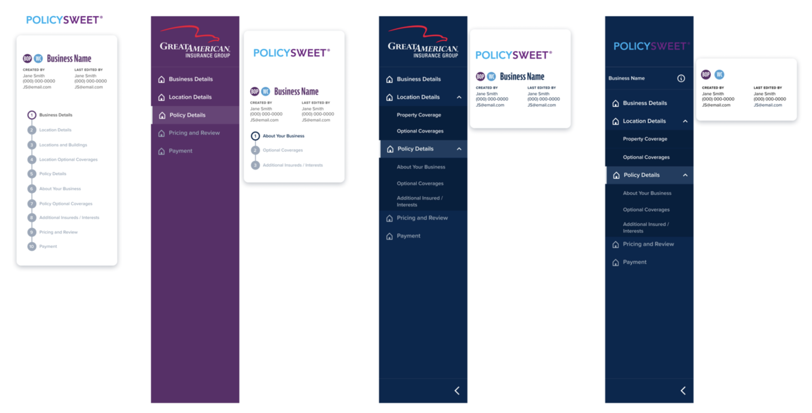
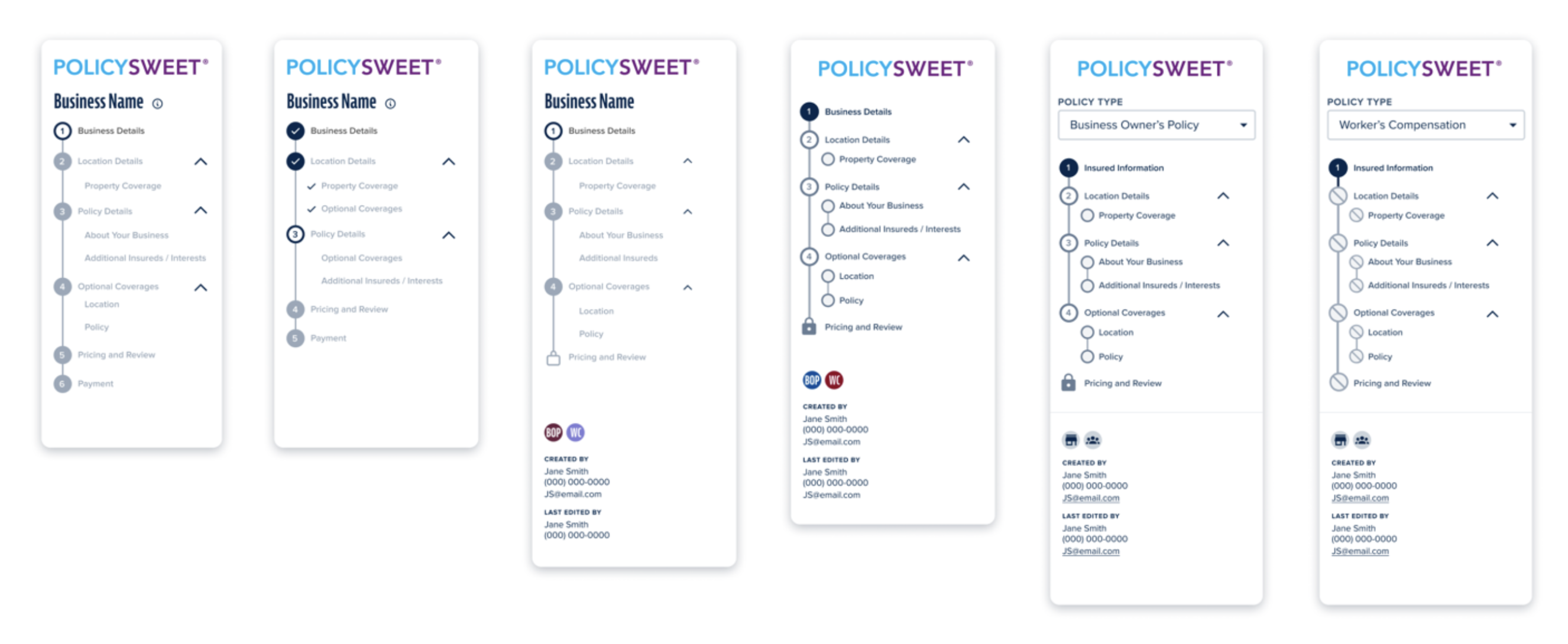
Stepper Iterations
Challenge #1: Designing at the Right Fidelity
One pitfall of working within an established design system is the ease of jumping directly into high-fidelity mockups. While efficient, this created unintended confusion with stakeholders, who interpreted early designs as final.
To reset expectations and improve collaboration, I shifted to low-fidelity wireframing using a Figma plugin. This change:
- Reinforced that designs were still exploratory
- Encouraged more open feedback
- Improved alignment during design reviews
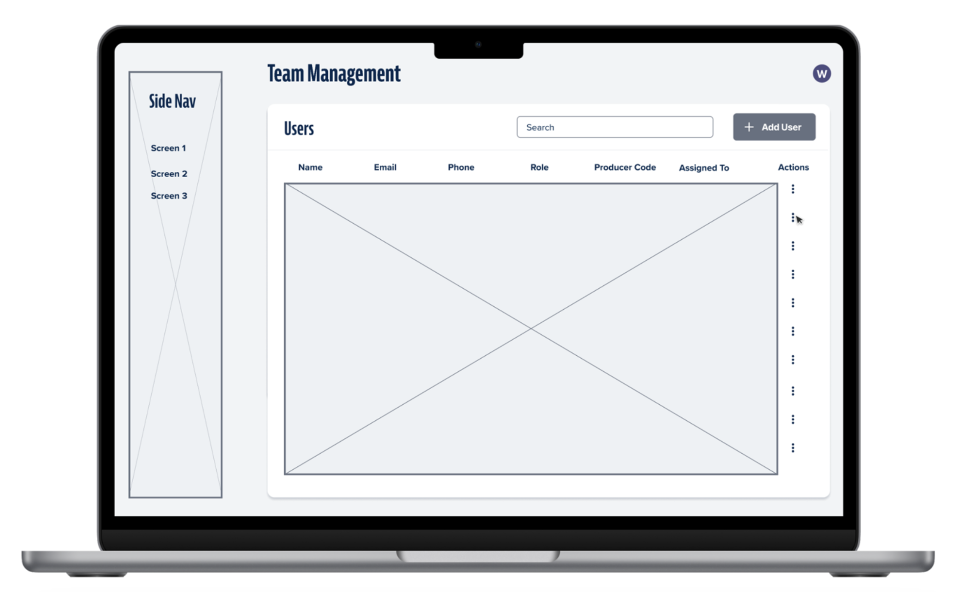
Example of a low-fidelity mockup using a Figma plugin.
Challenge #2: Backend Constraints Impacting UX
During the discovery phase, the team evaluated an existing internal API that had previously been built for backend use. Initially, it was approved as a viable option for the new quoter, however, once development began, several issues surfaced.
The API had been designed with no expectation of a front-end experience, which created challenges when translating its data into a UI.
These issues included:
- Inconsistent grammar and capitalization within question sets
- Content structures that did not align with intuitive UI patterns
Given project timelines, refactoring the API was not immediately feasible. Instead, I worked closely with developers to design around these constraints. The focus became balancing usability with technical limitations while minimizing friction for the end user.
Final Design
The team successfully delivered the B2B quoter within the 11-month timeline.
In addition to the core quoting experience, we designed:
- Role-based dashboards tailored to different user types
- Admin pages to support additional functionality based on access and permissions
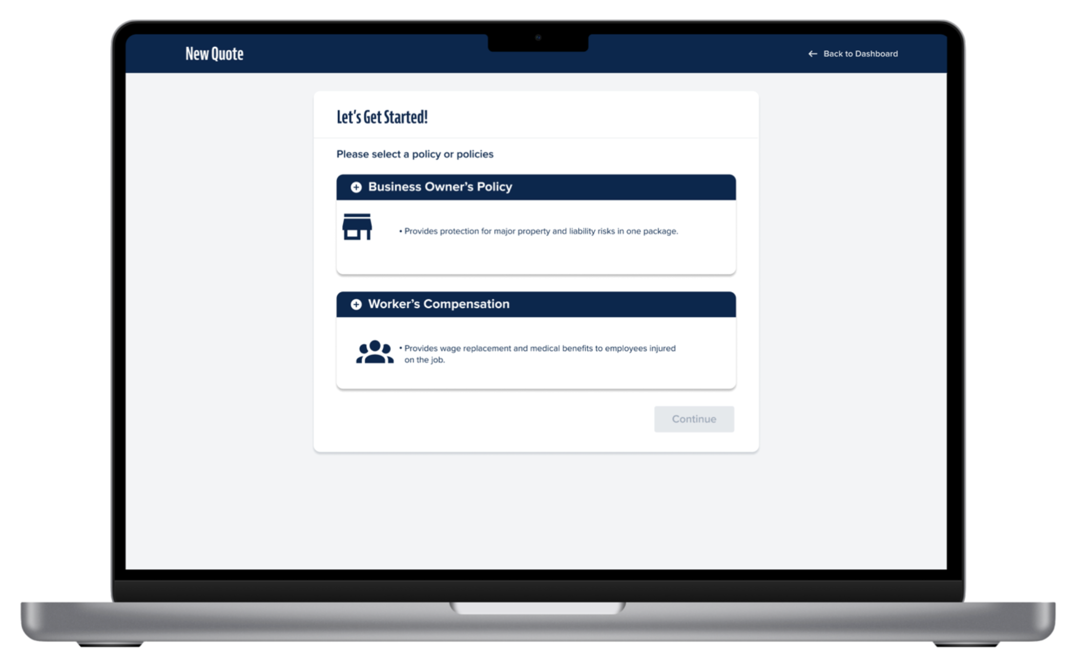
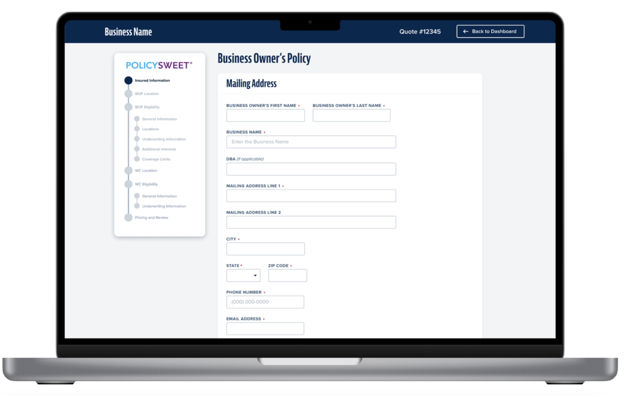
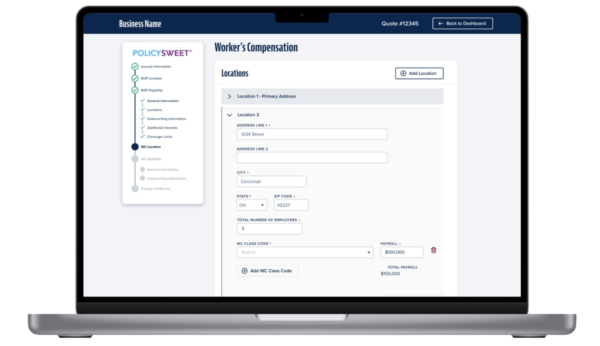
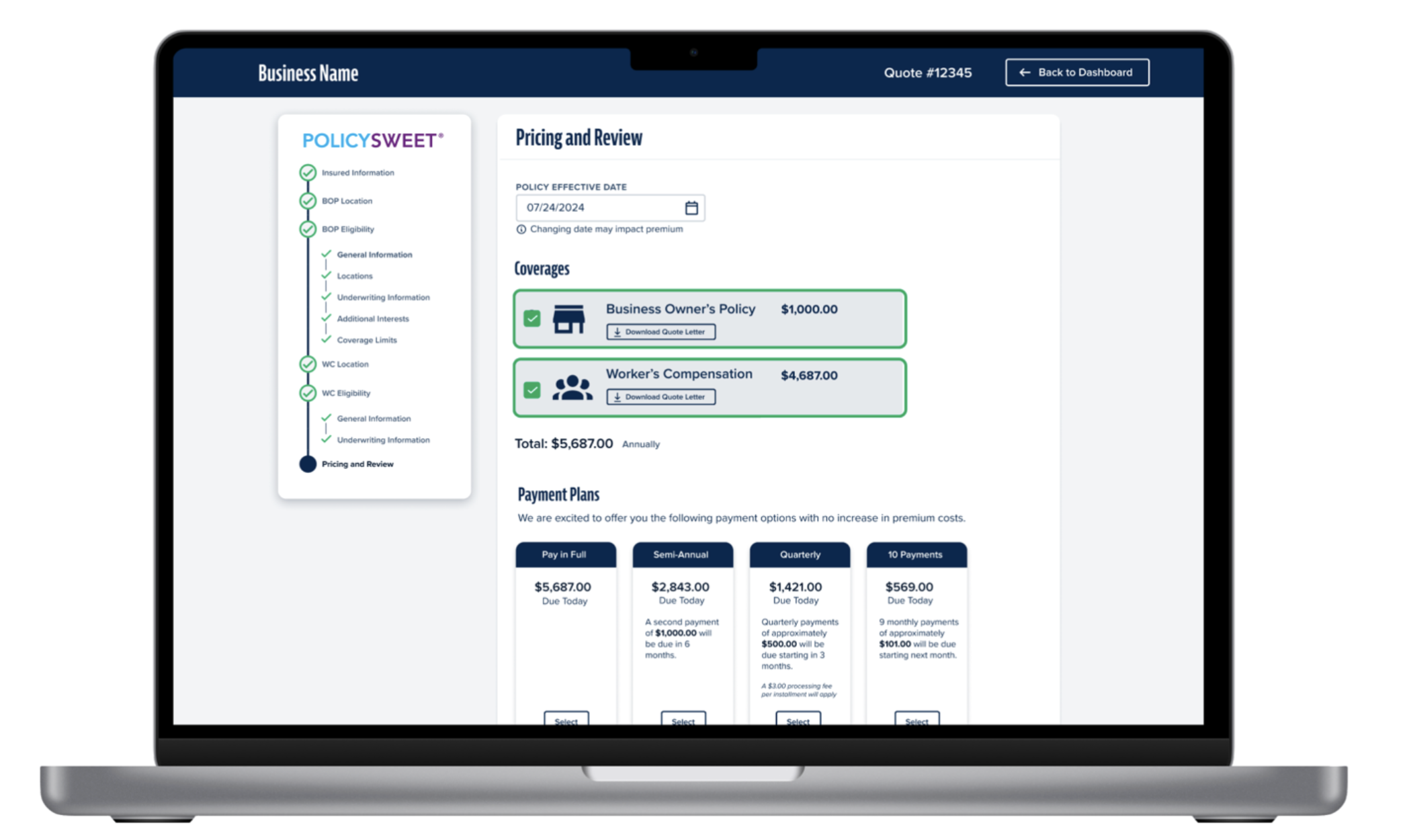
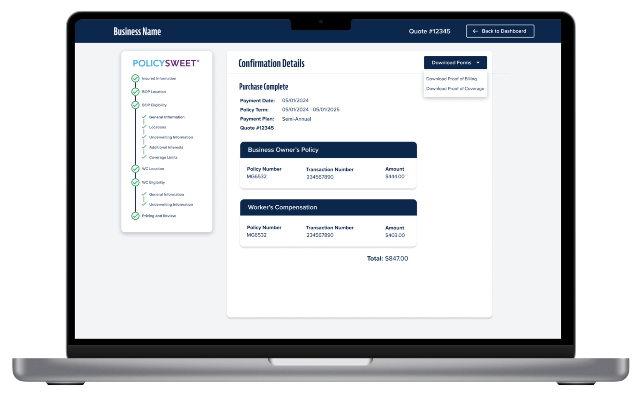
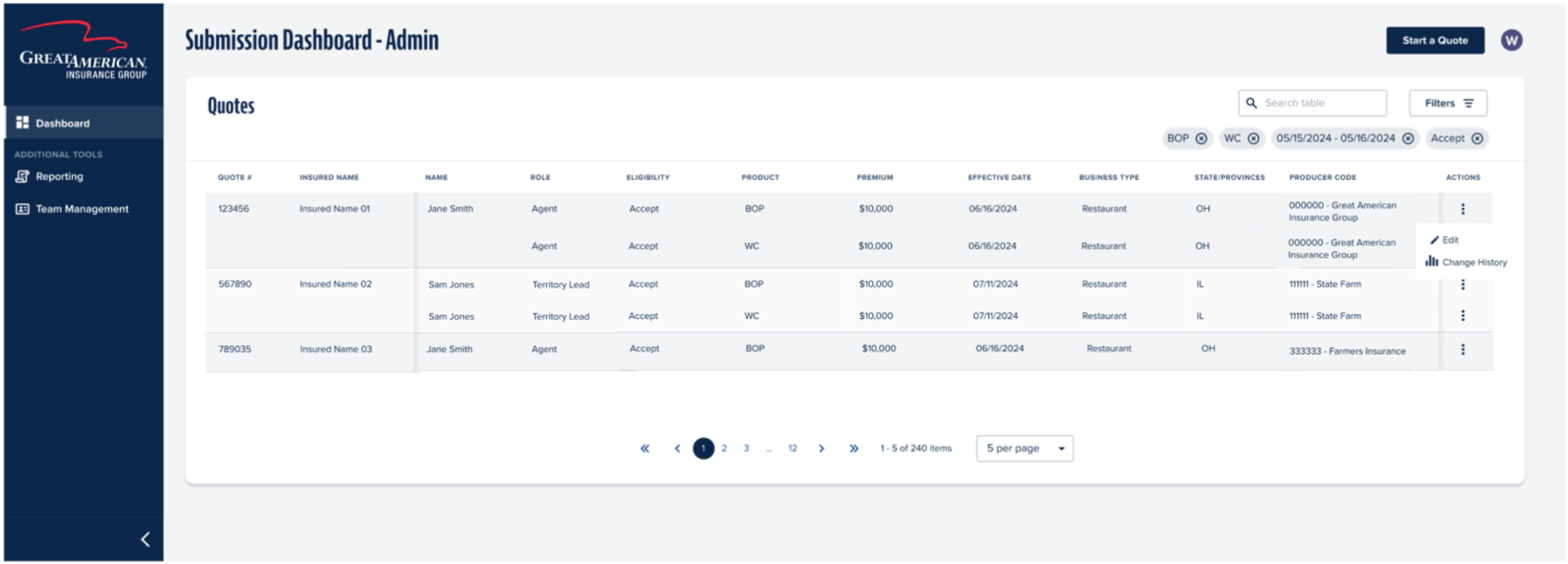
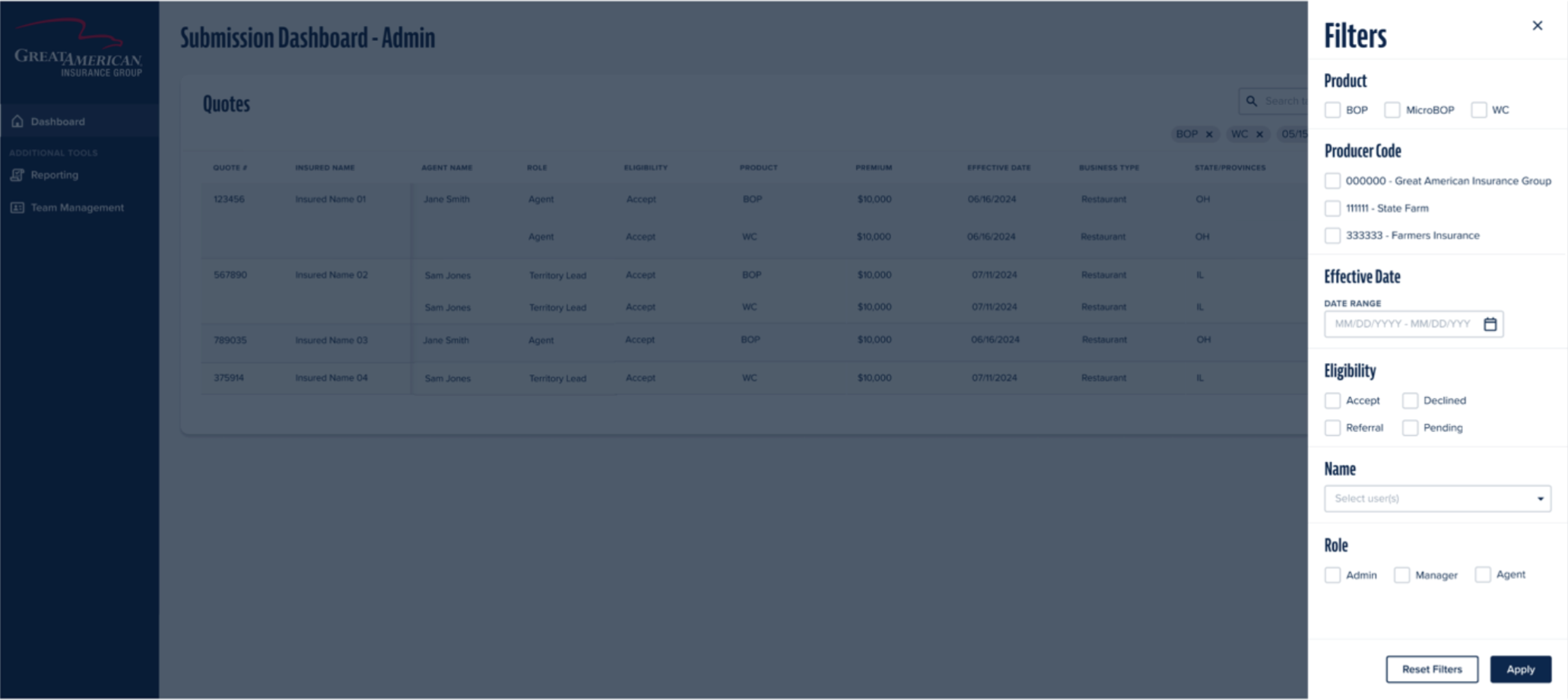
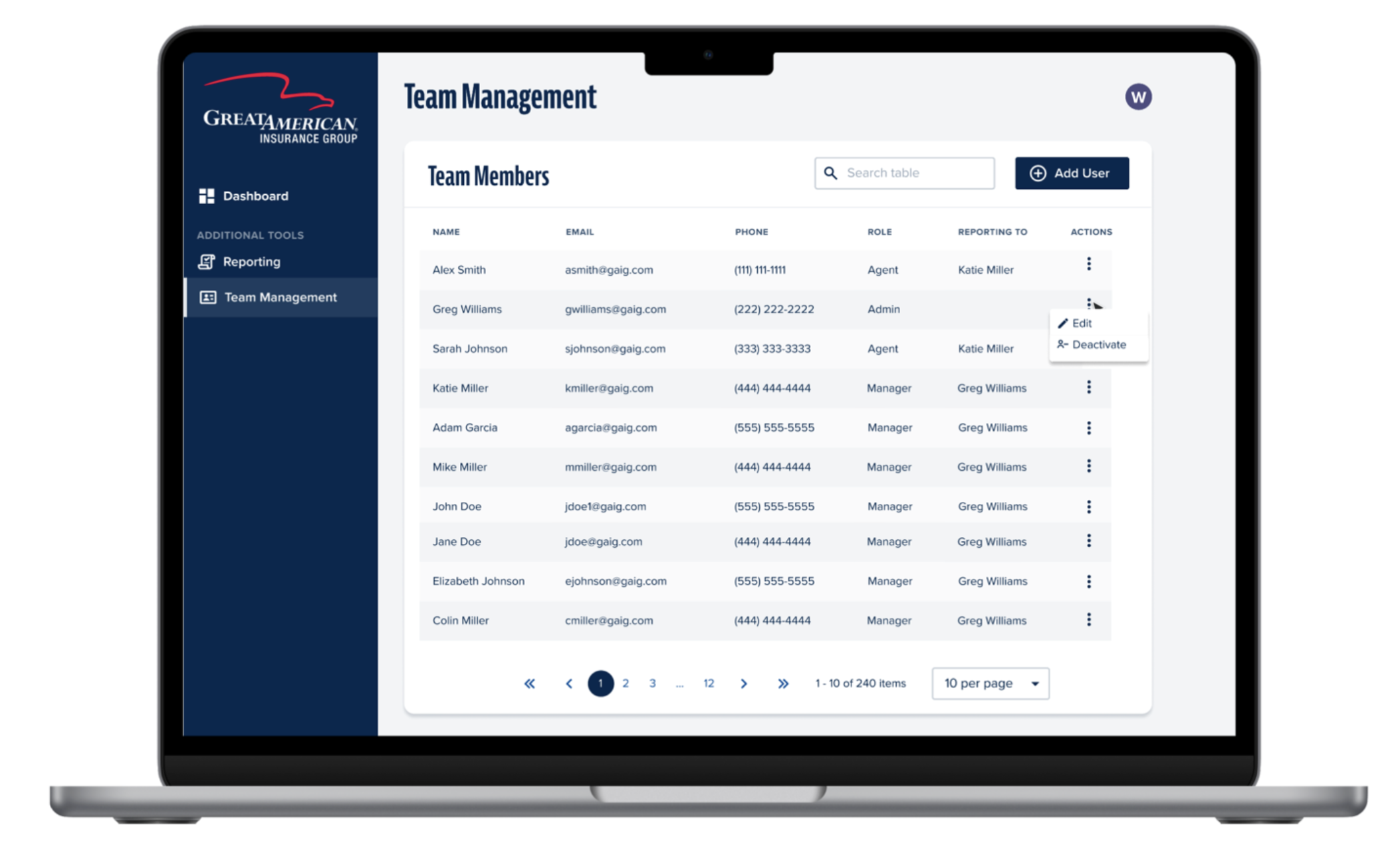
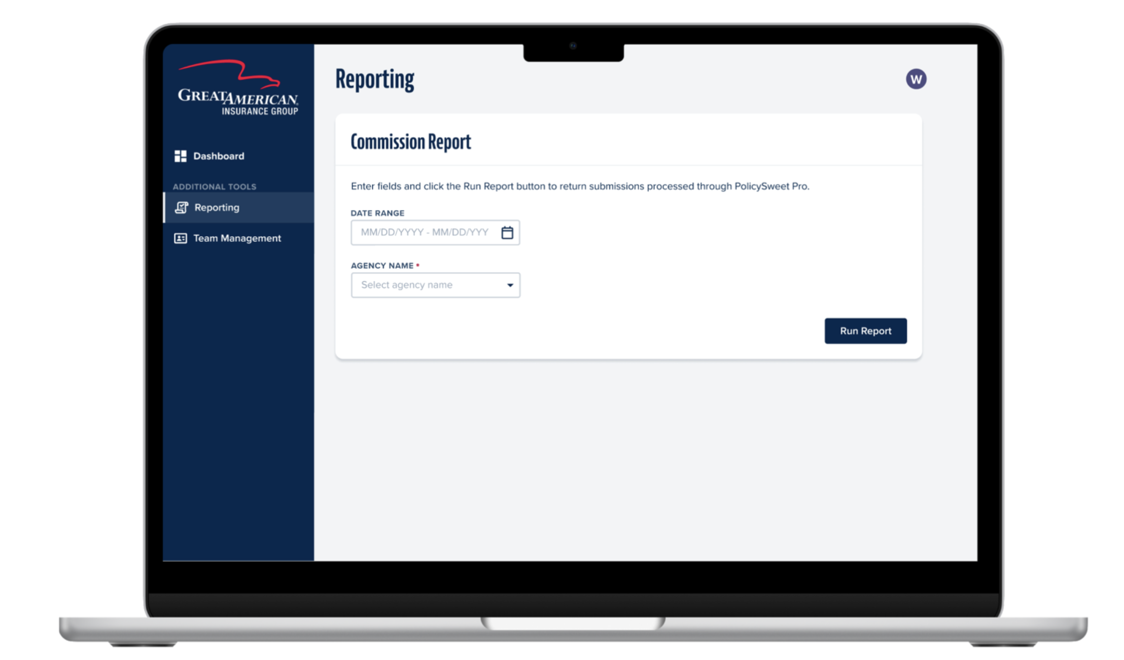
MVP Product
UX Audit
Because our lab focuses on delivering MVPs, I conducted a UX audit following delivery to identify areas for improvement.
Using Nielsen Norman’s 10 usability heuristics, I:
- Documented usability and UI issues
- Prioritized them based on severity and impact
This audit continues to guide ongoing product enhancements.
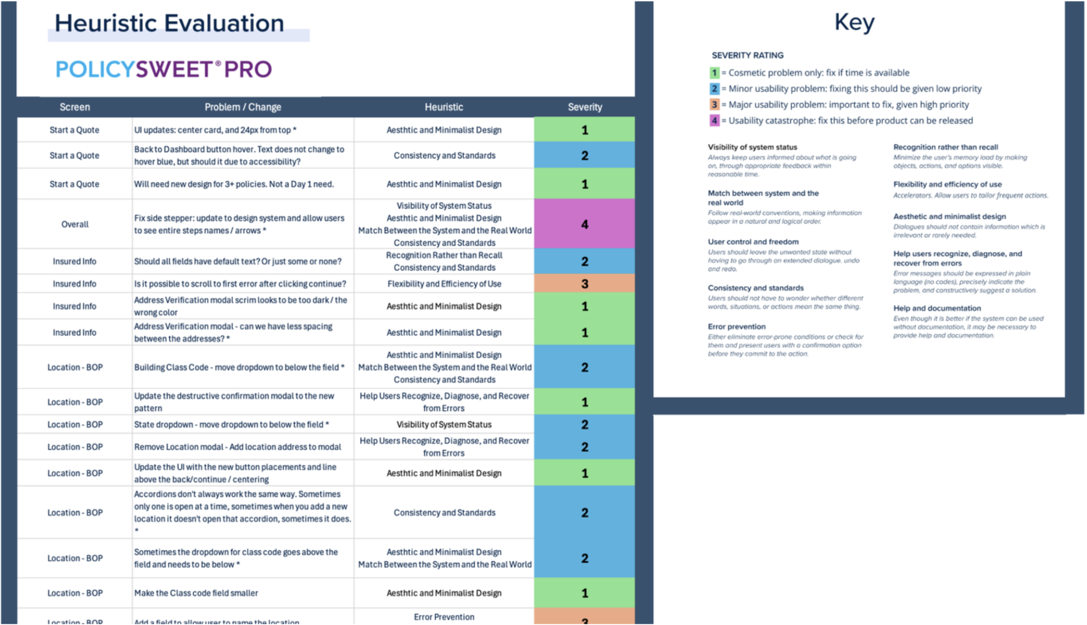
Example page from the UX Audit
Reflection
This was one of the more complex projects I’ve worked on due to constraints around user research and technical dependencies.
It reinforced several key takeaways:
- Early research helps reduce risk, but cannot eliminate uncertainty
- Strong collaboration is essential when navigating evolving constraints
- Effective design requires knowing when to advocate, when to adapt, and when to compromise
Ultimately, this project strengthened my ability to deliver thoughtful user experiences within real-world limitations.