Redesigning a Legacy Accounting Tool
Problem
The reinsurance accounting team relied on a tool that had remained unchanged for over 15 years. Over time, it became outdated, cluttered with irrelevant information, and inefficient for modern workflows.
Goal
Redesign and rebuild the application to better align with current user needs: streamlining workflows, removing unnecessary content, and improving overall efficiency.
Team
Product Owner, Project Manager, Developers, UX Designer
Tools
Figma and Miro
Context: Building on a Growing Design System
In 2021, a third-party vendor introduced an early version of the company’s design system. By 2022, the internal UX team had taken ownership, with a focus on scaling and maturing it into a robust component library.
This project became an early opportunity to apply and evolve that design system within a real product.
Hey there, this is the default text for a new paragraph. Feel free to edit this paragraph by clicking on the yellow edit icon. After you are done just click on the yellow checkmark button on the top right. Have Fun!
Research & Discovery
The project began with a product walkthrough led by the Product Owner, followed by user interviews with reinsurance accountants to better understand their workflows and pain points.
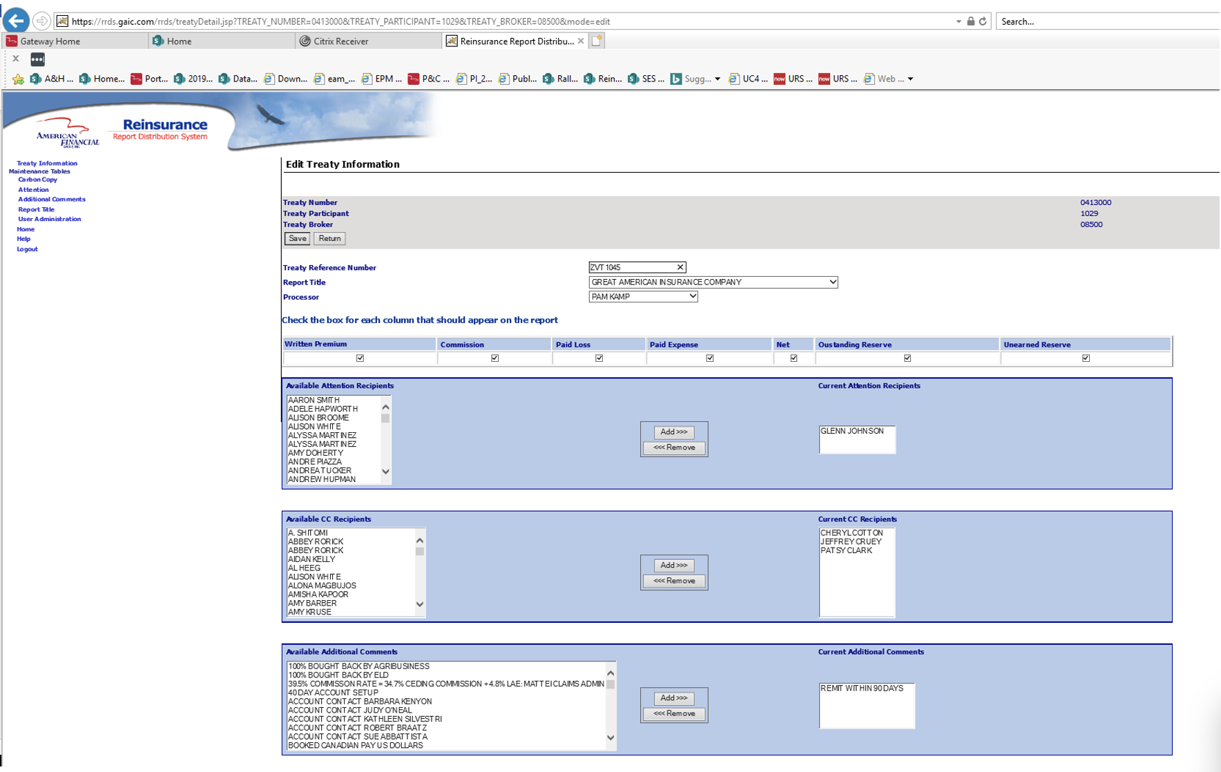
Original Tool
Two major issues quickly emerged:
- Excess content: Nearly 60% of the tool’s information was no longer relevant, creating unnecessary complexity.
- Inefficient workflows: Users were required to update reports individually, meaning hundreds of repetitive actions for large workloads.
By collaborating closely with users, I identified which features were essential and which could be removed. This informed our core strategy:
- Eliminate outdated and extraneous content
- Introduce a bulk update feature to significantly reduce manual effort
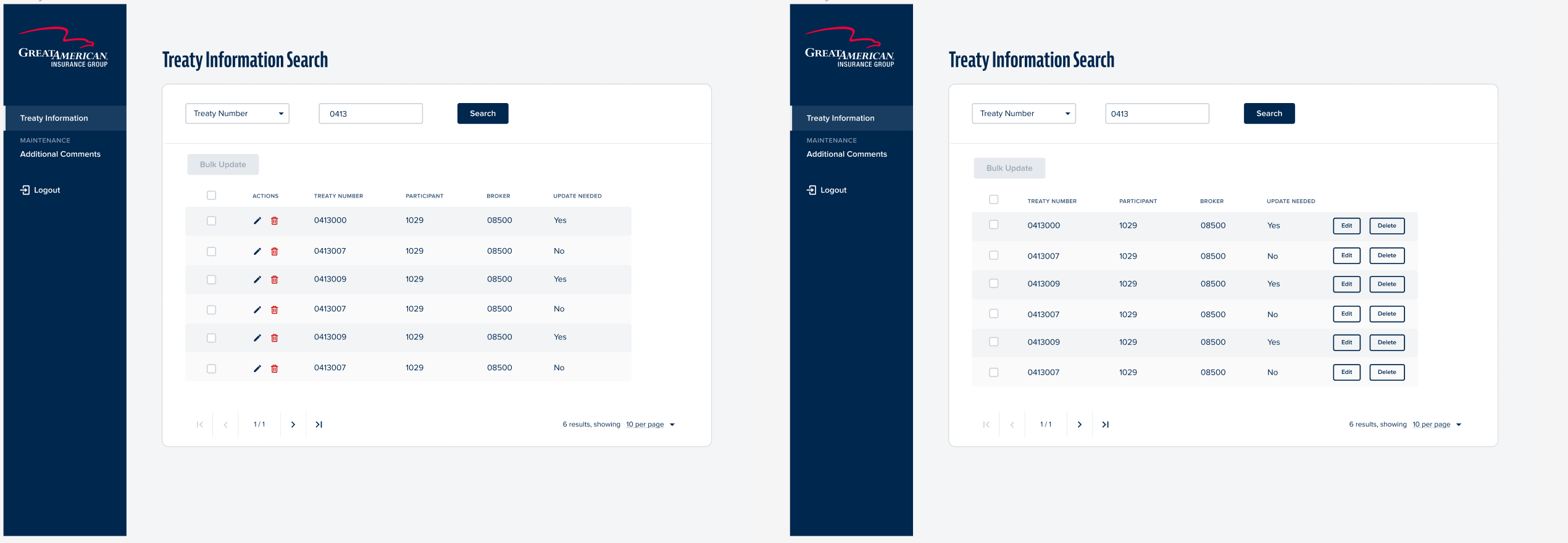
A/B Testing
Design & Iteration
Using the company’s emerging design system, I created initial concepts that emphasized clarity, consistency, and usability. Applying the system was critical to ensuring cohesion across products.
A key advantage of this project was access to a dedicated user group. Through regular feedback sessions and A/B testing, we validated design decisions early and often.
Interestingly, users ultimately preferred a hybrid of two design directions, reinforcing the value of iterative testing and early feedback. This allowed us to pivot quickly and align the solution with real user preferences.
Frequent validation sessions also ensured stakeholder alignment before development, reducing the risk of rework and technical debt.
During one session, I observed a pivotal moment: users realized the tool could evolve to better support their needs. After years of adapting to its limitations, they began to reimagine what was possible.


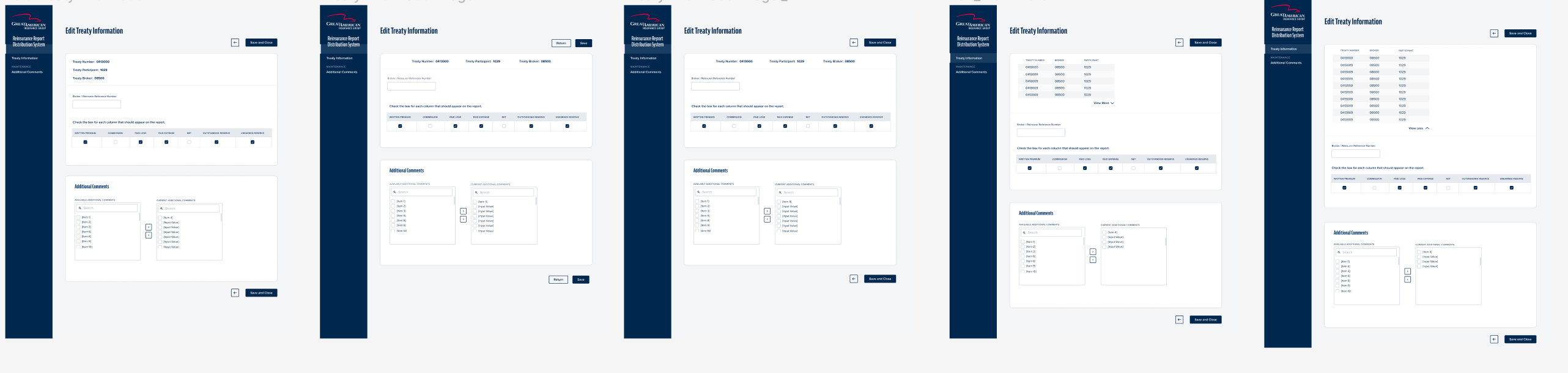
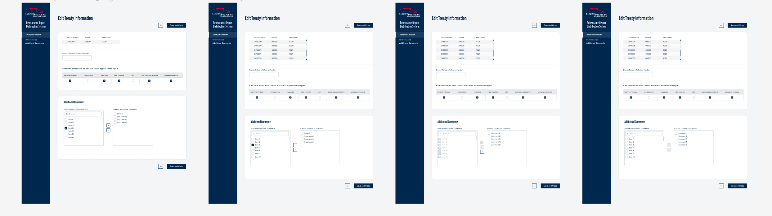
Iterations
Challenge
Late in development, QA testing revealed an unexpected issue: a hidden legacy bulk update function triggered under specific conditions, which conflicted with the newly designed feature.
To resolve this, the team collaborated in a series of working sessions and ultimately redesigned the UI to support both functionalities without breaking the experience.
Outcome
The project was completed in five months.
The redesigned tool significantly improved efficiency for the accounting team. Tasks that previously took hours, such as updating large volumes of reports, can now be completed in minutes using the new bulk update feature.
Overall, the redesign delivered:
- A streamlined, clutter-free interface
- Faster, more efficient workflows
- A more intuitive and modern user experience

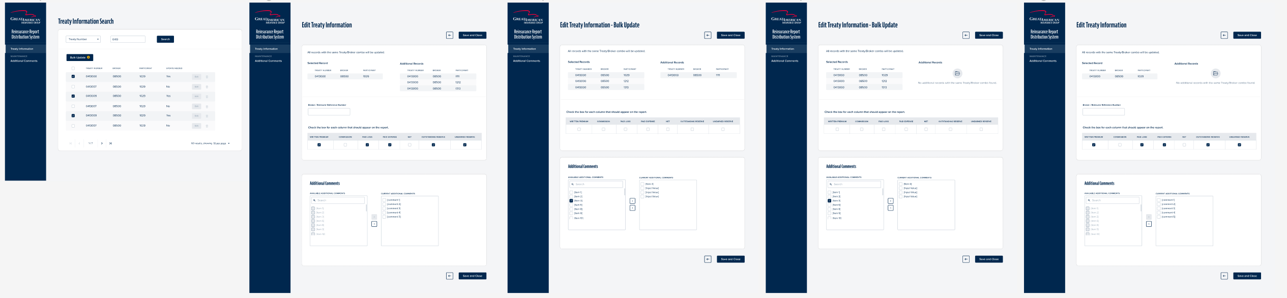
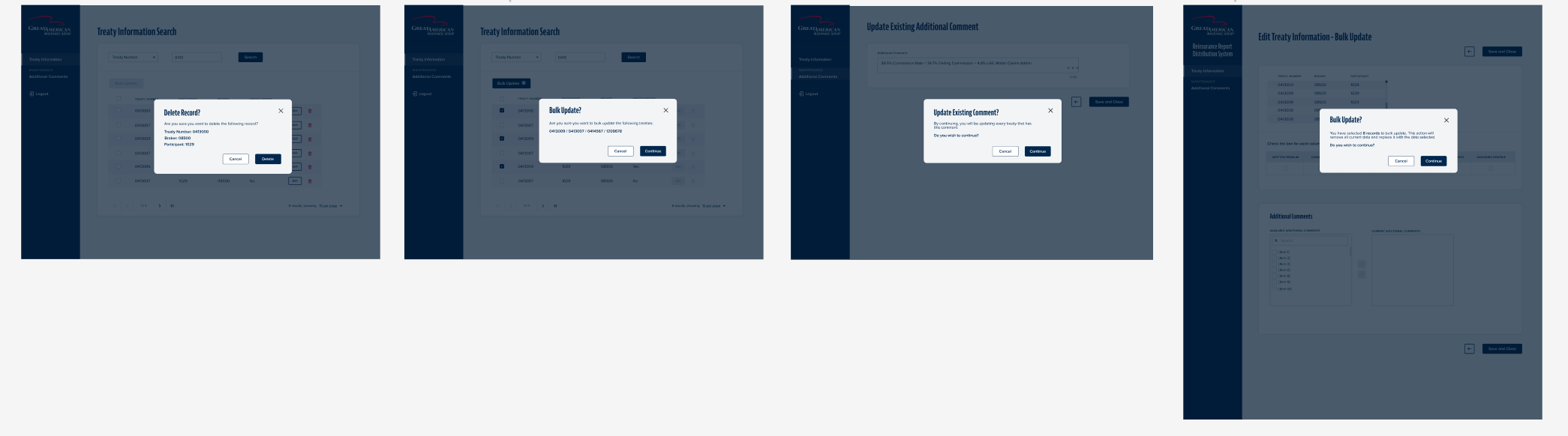


Final Designs
Reflection
This project highlighted the importance of balancing user comfort with innovation. While users were initially hesitant to change, consistent engagement helped build trust and openness to new solutions.
I also learned the value of aligning user needs with technical considerations. The most effective solutions came from understanding the root problems, rather than simply replicating user-requested features.
Even when the final solution looked different from what users initially imagined, it succeeded because it addressed their core pain points.